Mighty Girls branding - case study
Blackheath High School is an independent day school for girls aged 3-18, and is my alma mater where I completed my GCSEs and A-levels.
The marketing team reached out to me in 2020, keen to work with an alumna to produce branding, illustrations and collateral for their new project: the Mighty Girls Challenge. The program is aimed at the Junior School, and is designed to push the students outside their comfort zone through a series of challenges, while documenting their progress.
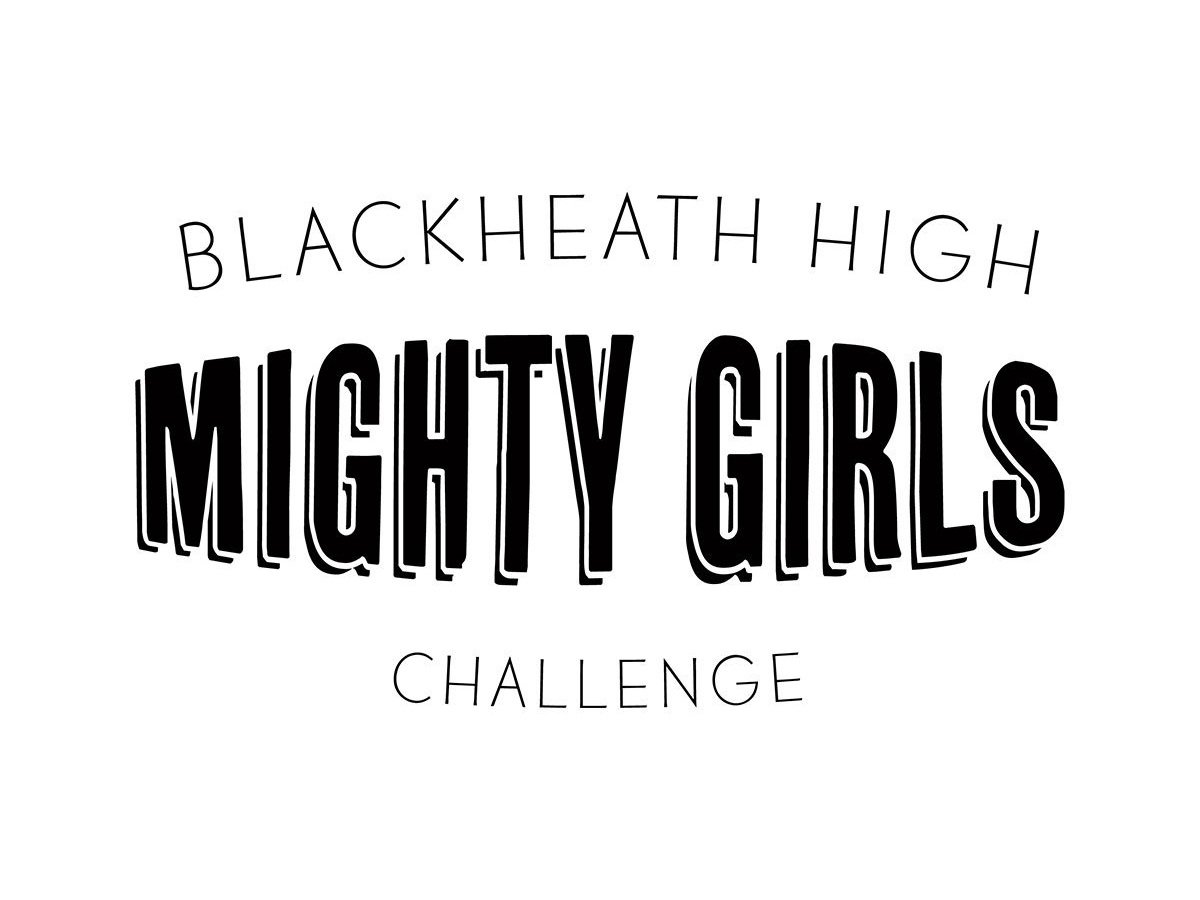
Part of this project was to create the logo which will feature on all the program content; the brief was that it needed to feel strong (mighty) and young; appeal particularly to the older (Years 5 and 6) girls and make them feel more grown up like a Senior School girl.
After several iterations, we settled on this simple logotype, as it is versatile yet embodies the youth and vigour of the program.
Additionally, the team wanted a set of three girls to embody the Blackheath High ABC - Ambitious, Brave and Curious. These girls needed to appeal to pupils from Year 2 to Year 6, and be representative of the school’s diverse demographic. I created these illustrations with input from the Year 6 Mighty Girls Club.
An additional set of poses was later created and the branding used across pin badges, postcards, an advertorial in Families Mag and, most importantly, the Challenge workbooks for each year of the program.
I very much enjoyed working with the team at Blackheath High, and three years later still consult for them in a Marketing and Design capacity.
In October 2023, this logo was included in the DesignRush article “Best Black Logos”.


