Kirica Group - branding
The Kirica Group owns high-end bespoke jewellery brands The Piece London and Kirica Fine. Their founder approached me to help her create a visual identity that spoke of the jewellery’s luxury nature, while conveying her own quirky and unique personality.
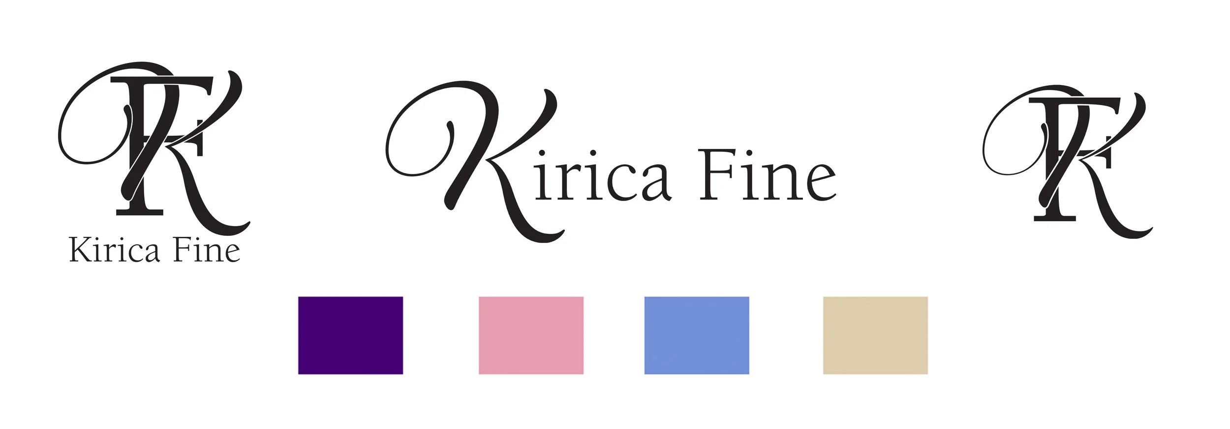
We started with Kirica Fine – high-end, ethically sourced gemstone jewellery for the adventurous mind. Every piece unique and many designed and created bespoke to order, the visual identity needed to effortlessly relay timeless luxury. We came up with the idea of a monogram as a classic reference to both bespoke and high-end fashion, with the initials wrapping around each other like jewellery around the body. With many of the pieces incorporating reworked vintage jewellery, the combination of the script and the serifed fonts reflects this meeting of old and new. While based on purchased, licensed fonts, I redrew individual letters and aspects of the curlicues to achieve the desired “wrap” effect.
The colour palette includes deep, gemstone colours alongside a neutral gold in a cohesive, flexible palette that allows for varied use while maintaining both adequate colour contrast and the nature of the brand.
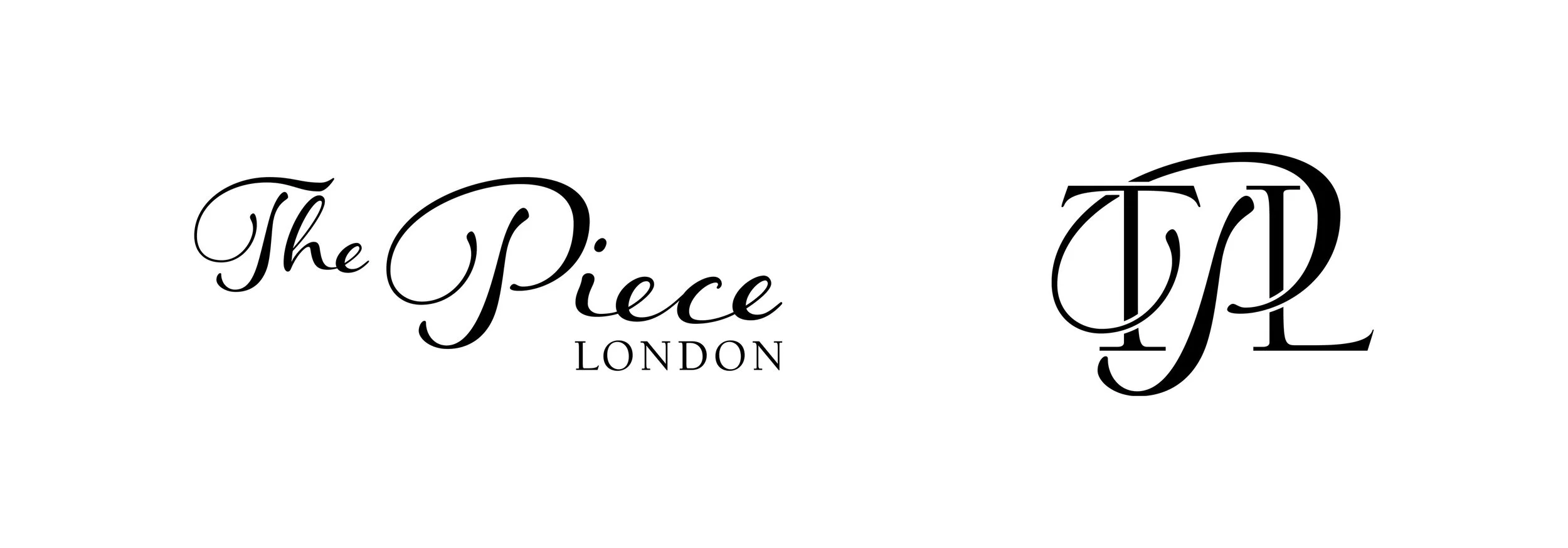
We then moved on to The Piece London – Kirica Fine’s quirkier, more affordable cousin.
Made to look part of the family but distinct in its own right, The Piece London utilises the same fonts and colour palette, but with an entirely different feel. Combined with rough, edgy illustrations of chains and leaning more heavily on the script font, The Piece London offers almost exclusively vintage, reworked jewellery. The signature product – chain rings – is reflected in the shape of the P, the chain motifs, and the intriguingly named “Curb Club”; the community surrounding this vibrant, youthful brand.
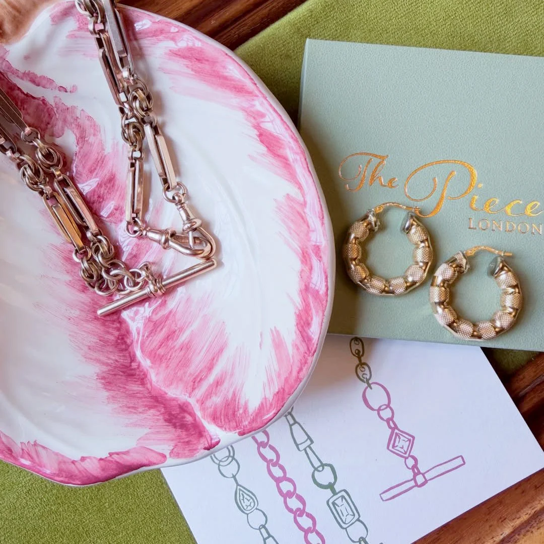
With over 40,000 followers tuning in to learn from founder Sarah’s expertise in gold and gems, the full brand package was essential for The Piece London, and we created photography and styling guides, business cards, and eye-catching packaging to round out the visual identity.
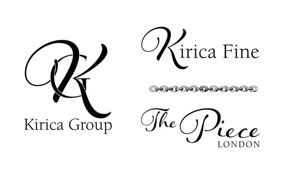
Lastly, we created the Kirica Group branding – the final element to pull together these contrasting but complementary brands, again using the same fonts, monogram and wrapping style.